The PS5 Is Huge. It Could Have Been Bigger
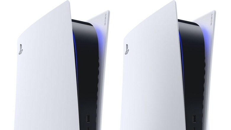
The PlayStation 5 is a radical departure from normal PlayStation conventions. The console drops the classic mono-black color scheme and adopts some white to look like an inverse tuxedo. More importantly, the PS5 is surprisingly huge, taller than the monolithic Xbox Series X. However, things could have gone differently. Instead of resembling the purported V-shaped dev kit or a black and white burrito, the PS5 was almost very different — i.e., bigger.
Recently, The Washington Post had a chat with senior art director Yujin Morisawa regarding the PS5's creation process. Morisawa revealed he enjoyed the internet likening the PS5 to various objects, and that he had to tone down his original design. According to Morisawa, he started designing the PS5 before he had any idea what the engineers would do, so he just prepared for the worst by creating something that was too big.
Morisawa had no idea what hardware would go into the console, so his first concepts were an experience unto themselves. Morisawa stated that he wanted to make the PS5 feel comfortable but also provide an air of power with just a hint of an organic aesthetic for flavor. Eventually, internal components became a design factor, and he brainstormed how to fit them into the console while permitting enough air flow and a big enough heat sink to maintain a cool environment. Moreover, much of Morisawa's aesthetic hinged on a single question: "Should it look like the PlayStation 4's successor or should we go beyond whatever we designed before?" Morisawa chose the latter. Then he was told to tone down the console's size.
When asked to redesign the PS5, Morisawa was told to go even smaller and thinner. However, if a console is too thin, it easily overheats, and Morisawa channeled his experience developing personal computers to prevent the PS5 from reaching that point. As the PS5 stands now, Morisawa believes it is the ideal size to fit all the internal components without compromising the much-needed air flow space.
The PS5's shape and size didn't mark the end of Morisawa's design responsibilities. He also was in charge of giving the console and its controller their color schemes. However, instead of following the "beyond" aesthetic that permeates the physical shape, Morisawa went in the opposite direction for colors. He wanted the hues to embody simplicity and universality, so he got rid of them. Nothing but black and white (and blue lights). Even the controller buttons, where colored symbols were tradition, are monochromatic.
Morisawa put his all into even the smallest of design details, including hidden ones such as the DualSense's PlayStation symbol-shaped goosebumps. According to Morisawa, even more design Easter eggs wait to be discovered. Given what Morisawa invested into the design process for the PlayStation 5, you can only imagine what he will do for the inevitable PS5 Slim and PS5 Pro.

