PS5 Fan Designs That Might Be Better Than The Real Thing
Sony has been frustratingly coy about revealing what the PlayStation 5 looks like. We know an incredible amount about its next-gen guts and how ultra-fast it will be, but for the moment, we're clueless as to what it will look like sitting in our living rooms. Things only got more confusing upon the release of the new DualSense controller. The successor to the DualShock is sleek, modern, and oddly two-toned. Will the PlayStation 5 also rock a black and white look? Will it sit flat or utilize the tower-like design that the Xbox Series X has embraced?
Without any of these answers, fans have let their imaginations run wild. Talented designers have taken it upon themselves to invent their own PS5s. These fan concepts are seriously alluring, so much so that it might be a disappointment when Sony finally gets around to revealing the actual design of the PlayStation 5.
Modern matte with a retro twist
Remember the OG PlayStation? Reddit user ruddi2020 does. That's why, in their interpretation of what the PlayStation 5 could look like, they included a subtle circle on the top of the console. This circle marks where players can rest their DualSense controllers to wirelessly charge–pretty nifty. A departure from previous PlayStations are the rounded corners, which make the console look a little less severe.
The only color on this matte black mock up is a thin blue bar that indicates whether or not the console is turned on. This thing is compact to match a minimalist mindset with, as one commenter pointed out, not many cracks for dust to hide in. The concept's functional but fun design makes it a winner in our eyes.
Like the dev kit, but better
One of Reddit's favorite concept designs was crafted by graphic designer Brian C. Worton. He based the mock up on the developer's kit that leaked earlier this year. The dev kit is... chunky and kind of ugly to be honest but Worton managed to make it sleek, minimalist, and downright desirable. He embraced the two-tone design of the DualSense controller, applying a white outer shell to a matte black core console. The black parts sport a subtle, textured design that gives the console a high quality feel. What's more is that, like the DualSense controller, Worton has added in a glowing blue bar where the disk drive sits.
Not into the black and white look? No problem. Worton mocked up an all black console and a grey-and-black one as a callback to the olden days of PlayStation. With these options in mind, it's easy to see why Reddit is going gaga over this ultra-modern, handsome concept art.
Light and thin
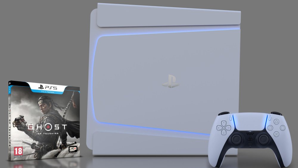
Reddit user ruddi2020 can't stop making PS5 designs. And really, we don't want them to stop because they're seriously good at it. Rather than matte black, their new design pivots to a shiny, white chassey that is as thin as thin can be. Staying practical, they have smartly added in fan vents on the side (or top and bottom, however you want to look at it) to keep the console cool.
Inspired by the DualSense controller, ruddi2020 has thrown in a glowing, polygonal shape to the side (or top) of the mocked up PS5. This subtle, almost ghostly glow makes the design look like it was pulled straight out of Cyberpunk 2077 and we love it for that. The next generation console should look like it's from the future, because it is, indeed, the future of gaming.


