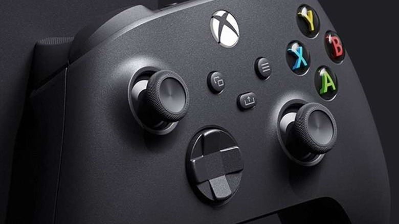
Xbox Series X's New Logo Means More Than You Know
The new Xbox Series X logo has been revealed early, thanks to a recent trademark filed by Microsoft. It's very different from what many of us were expecting, diverging quite a bit from previous Xbox logo designs. In this design, the usual curved and futuristic "X" designs of the past have been replaced by a large block letter "X" with a line through the middle, as well as the word "Series" off to the lefthand side. It's a major departure from previous Xbox branding, but there may be more to it than we realize.
Tom Warren, Senior Editor at The Verge, pointed out on Twitter that this logo's styling greatly resembles a mysterious design trademarked a few years ago by Microsoft. This one depicted the letter "S" with a similar line dividing it in the center. At the time, the prevailing theory was that the logo was intended for Microsoft's "Project Scorpio," which was the working title for the Xbox One X. Obviously, Microsoft ended up going a different way with the final logo for the Xbox One X, but this new trademark could signal a return to their original plan for branding future consoles.
Some fans think this logo could just be used for merchandising and the like, while the console itself will presumably have the design we've seen before. However, there's another interesting fan theory. Some have speculated that the reason that the X is so prominent in the logo because it's not so much a name for the console as it is a designation for a particular version of the console.
"Crazy Gamer Theory: There is going to be an XBOX Series X, Y, and Z," tweeted one fan. "Each will do something different at varying price points. For example the Series X is your standard next-gen console. Y would be a less powerful but cheaper version." This fan then suggests a "Series Z" could be akin to a handheld console like the Switch.
It's an interesting idea, and not entirely out of the realm of possibility. After all, Nintendo took a similar tactic with the aforementioned Switch, releasing the pared-down Nintendo Switch Lite at a lower cost to customers. In this hypothetical scenario, the difference between a theoretical Series X and Series Y could be compared to the difference between the PlayStation 4 and the PS4 Pro.
It's no surprise that people are looking for hidden meanings in the new logo. It's also interesting to see a major company like Microsoft taking a risk by rebranding in such a way. After all, people weren't entirely enthralled by the PlayStation 5's logo, which didn't do much to differentiate itself from previous console generations, other than the obvious change in numbering.

